Logo
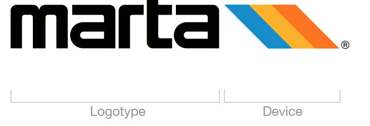
The standard MARTA logo, also known as the Signature, is comprised of the Logotype and 3-color Device. The Logotype creates the feeling of a path, and the Device utilizes MARTA’s iconic 45° angle and 3 primary colors.
The Logotype is always adjacent to the blue color band within the Device. The Device is always equal height to the lowercase letters in the Logotype.
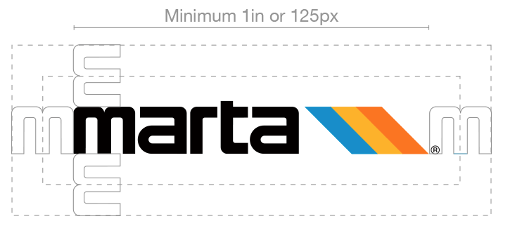
Clear space is equal to the width of the “m” in the logotype on all sides to protect its visual integrity. When the logotype is printed larger than 14 inches, reduce clear space to 1/2 the “m” width.
The signature logo should appear no smaller than 1” wide in print and 125 pixels wide on the web.

When the MARTA logo is depicted against a dark background color, the Logotype should be displayed in reverse (white) and the colors of the Device should remain.
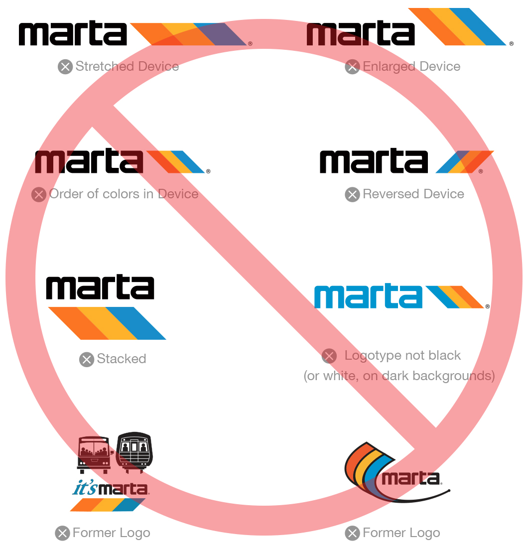
Common Mistakes
Logotype

In some cases the Logotype can be used as an independent element separate from the graphic Device and should be solid black. When depicted against a dark background color, the Logotype should be displayed in reverse (white).
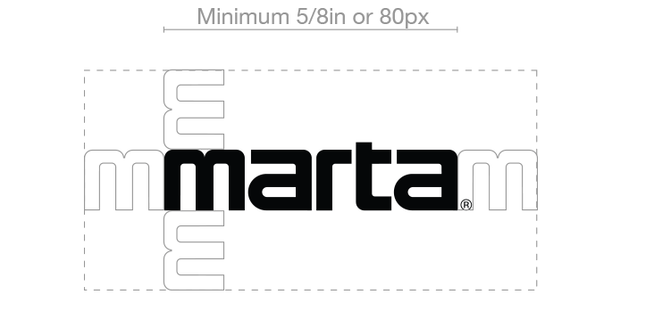
Clear space is equal to the width of the "m" in the logotype on all sides to protect its visual integrity. The Logotype should appear no smaller than 5/8” wide in print and 80 pixels wide on the web.
Alternate Logos & Sub Brands

This Reversed Signature is shown with the device angled from top right to bottom left and is used only on the exterior, passenger side of MARTA vehicles.

Co-Branding

Business names, departments, slogans or other logos are placed to the right of the MARTA Signature logo and set apart by use of a black vertical rule. Text should be set in Helvetica Neue Light Italic and centered vertically.

Trade Partnership
